Virtual Environments - Guildhall Project
Wednesday, 4 January 2012
Final Video
This is the final video production of the Guildhall tour. I took the renders that we had created in 3DS Max and imported the files into Adobe Premiere Pro in order to produce the final video.
Once the video components had been successfully edited to produce a smooth video, I added title components to label certain parts of the building. I then recorded a voice-over to give information to the viewer about which part of the building was being shown.
Overall, considering we only had two members in our group, I am pleased with how the final production turned out. I would've liked to have used the hand more throughout the video, but in the end the time constraints meant it wasn't feasible given the small relevance of the hand to the final production. Despite this, I think we can be proud of what we have achieved in this module.
Tuesday, 3 January 2012
Animation Techniques
In animating the Guildhall sequence, I used a variety of techniques. The most common technique was path constraints - attaching a camera to a path that had been drawn in 3DS Max. This was very useful for capturing different areas of the Guildhall and providing good camera shots. It also enabled a first person view of the Guildhall, which was key to the animation - providing a tour around the building.
To open the doors I simply used a rotation tool - I had already modified the pivots to the correct position when initially creating the doors. In one of the scenes, Martyn created a hand that pushes one of the doors open.
Finally, I used a more advanced animation technique that strips away sections of the model, revealing the inside structure of the Guildhall. This was achieved by grouping areas of the Guildhall together and applying the slice modifier. When animated, this was used to slice away the landscape first, followed by the walkway, and finally slice the back wall away from the Guildhall so that the camera can then sweep in on a path constraint to show the different rooms.
Thursday, 29 December 2011
NEW Technique - Multi/Sub-Object Materials
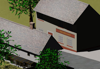
Some scenes in 3D Studio Max require many different materials to be used. Also, sometimes you need to apply different materials to different areas of an object. This is the technique that I learnt to overcome these problems.
In 3DS Max there are only 12 material slots by default. This can be increased to 24 by right-clicking on a material slot and selecting the 6x4 Sample Windows option. But if you need more than 24 slots, or you need to apply different materials to different areas of an object you can use something called Multi/Sub-Object materials.
By selecting the Multi/Sub-Object in the Material/Map browser, you then get the option to keep the material in that slot as a sub-material or to discard it. If the slot is empty to start with, it doesn't matter which option you choose. You then get a list of 10 material slots under a menu titled Multi/Sub-Object Basic Parameters. This can be extended as required. Each slot has it's own ID number and there is also a box where you can give the material a name.
In each of these slots you can create materials as you would in the normal material editor by simply clicking on the buttons labelled "Material # (Standard)" in the Sub-Material column. Alternatively, if you already have a material that you need to make into a sub-material then you can drag and drop it from the browser onto this button.
Once you have a few sub-materials defined you can the apply the multi material as you would any other material by dragging and dropping onto the relevant object. The object needs to be converted into an editable poly (if it is not already one). Once the material has been applied you need to go into sub-object mode and select the faces option. This is where you define which of the sub-materials to apply.
The best way to start is to define the main material you will use. For example, when making the Guildhall, the bottom of the outer walls consists of brickwork, whilst the rest of the wall is white masonry. Therefore it makes sense to apply the white masonry material to the whole wall first and then go back to define where the brickwork needs to be. You can do this by selecting all of the faces in the wall. Then, in the sub-object menu on the right hand side you can navigate down to a section called "Polygon: Material IDs". Now, in the Set ID box you simply need to enter the ID number of the relevant sub-object material. For example, if white masonry was in slot number 1 of the multi material, then we'd enter 1 in the Set ID box.
Now it is simply a case of selecting the faces that you wish to apply a different material to. In the Guildhall project, this was the bottom row of faces on the outer wall. You then follow the same method, entering the relevant ID number in the Set ID box. This technique allows you to apply as many different materials to one object as you wish. Also, if all of the 24 material slots in 3DS Max were used as Multi/Sub-Object materials, then it would allow you to have 240 different materials before you needed to add any more ID slots.
In the Guildhall project, I used this technique in a few different areas. As mentioned, the key area was the bottom row of bricks on the actual Guildhall itself. Also, when creating a basic model of the pub across the road and the houses next to the Guildhall, this technique came in very useful. I created basic textures in Adobe Photoshop CS5 for the fronts of these buildings. The, I created a box-shaped object with two height segments. I applied the bitmap material of the front of the building using a UVW-mapping modifier, and then I could match the colours all the way around the building by applying different colour materials to the different height segments.
Application of Materials
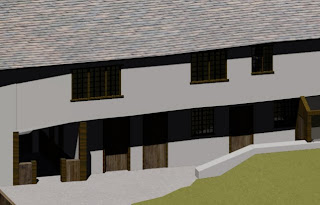
Throughout the Guildhall, several different materials were required. Altogether, I used 12 single material slots and then 4 more for multi/sub-object materials which I'll talk about in the next post.
The 12 single slot materials used were as follows:
- Front/Rear/Left/Right Elevation reference planes
- Ground/Upper Floor reference planes
- White masonry
- Dark grey stone
- Clear glass
- Dark brown unfinished wood
- Translucent glass
- Lighter grey stone
- Roof tiles masonry
- Brickwork masonry
- Lighter unfinished wood
- Standard grass bitmap
The reference planes materials were created in Adobe Photoshop CS5 and set up as standard materials with a bitmap diffuse setting. This setting can be found under the Blinn Basic Parameters menu, by clicking the square box next to the Diffuse option and selecting Bitmap. This technique was also used for the grass material.
The white masonry material was created by navigating to the Architectural menu and selecting the masonry option from the drop-down option box. Then, I simply set the diffuse colour to white under the Physical Qualities section. I used this approach for creating several of the other materials too. The roof tiles and brickwork masonry were created in the same way, but instead of setting a diffuse colour, I applied diffuse maps that I had created in Photoshop. The dark brown and lighter brown wood materials were created in the same way, selecting the unfinished wood option from the drop-down option box and then applying diffuse maps created in Photoshop.
The dark grey and lighter grey stone materials were also created from the Architectural menu too, only this time selecting the stone setting from the drop-down option box. The clear and translucent glass materials were pre-set options on the drop-down option box.
The various materials were used for many different areas throughout the scene. The walls, floors and ceilings of the building used the white masonry material. The beams, window and door frames, stairs and even the handrails leading up the staircase all used the dark brown unfinished wood material. This was also used in the landscape for the fences. The lighter brown unfinished wood material was used for the doors, however this was too far away in shade from the frames at first so I had to edit the colour balance and contrast of this material in Photoshop. The majority of the windows in the building used the clear glass material. However, I noticed that some of the windows are in rooms that will be used as bathrooms. For these windows I chose the translucent glass option.
The roof of the building used the roof tile masonry material, whilst the brickwork masonry material was used for the chimney. Around the landscape, the grass material was clearly used for the grassy areas, whilst the dark stone material was used for the road. The lighter stone material was used for the pavements.
Friday, 23 December 2011
Landscape
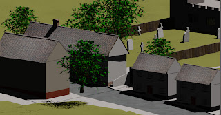
In order to give a sense of setting to the Guildhall, I created a basic landscape around it. This featured a very basic model of the church and graveyard behind the Guildhall, two houses next to the Guildhall, the Red Lion pub opposite the Guildhall, as well as the road, pavement and grass.
The road, pavement and grass was all created from very large box shaped objects, converted to editable polys. For the grass, I moved some vertices around using the soft selection option in order to give the land some variation. I had considered using the noise modifier for this but felt that this would give too much variation.
The gravestones were simply a few basic shapes with the white masonry material applied, whilst the church, houses and pub were again very simple box models with materials applied. For the pub and the houses, the material was created in Adobe Photoshop CS5 and applied using the UVW-mapping modifier and sub-object material technique.
I also added some trees using the foliage option from the AEC Objects menu. Finally, I added a daylight system to the scene to give proper lighting. In order to achieve this I used Google Maps to determine which direction North faces and set the compass rose to point in this direction. This ensured that the lighting positioning would be correct for the scene. I then set the date to June to give a bright summertime lighting.
Thursday, 22 December 2011
Glazed Walkway
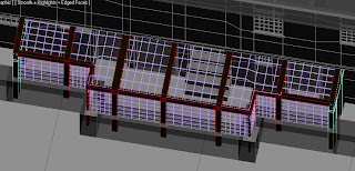
To create the glazed walkway, I began by laying out the wall at the bottom. By using box shapes and moving them to correct positions following the reference planes. From there I could create the wooden beams - again using the same method. I had to use the rotate tool in order to get the beams positioned correctly in line with the building.
Creating the panes of glass was simple for the sides of the walkway - again just a case of creating box shapes and moving them into place. However, on top of the walkway, some of the panels needed to be modified as it wasn't a completely square position between the beams. I converted them into editable polys and achieved the correct shape by dragging the vertices into place.
Finally, I had to create doors at both ends of the walkway. I used the same method for this as I had in the previous section, when creating the doors for the building - creating a box, and moving the pivots to the correct position.
Friday, 16 December 2011
Stairs
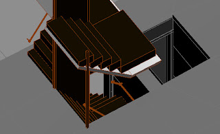
When creating the stairs, the method used was quite simple - creating boxes, cloning and moving. However, fitting them into the space provided proved quite a task.
The stairs towards the right side of the building were quite simple to create. The space was adequate and the shape was a simple U-type staircase. As mentioned, it was built with boxes, cloning and moving them into position. I created a hand rail using cylinders and spheres for the joints.
The staircase near the lift well proved more tricky however. I found the space quite limited and although I used the same method as before, it was a squeeze to fit the stairs in. This staircase was an L-shape style. It also leads to the attic and, although I took the decision not to model the attic, I still needed to model the staircase leading up to it as this may be shown in the animation.
Subscribe to:
Comments (Atom)